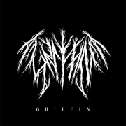
Edgy and Distinct Grunge Fonts in Metal Logos
Edgy and Distinct Grunge Fonts in Metal Logos

Grunge fonts have been a popular design element in metal band logos for decades, with their edgy and distinct aesthetic perfectly matching the aggression and rawness of the music. Let’s explore the impact of grunge fonts in metal band logos and why they have become such a beloved choice for many bands.
-
Edgy Aesthetic
Grunge fonts are known for their rough, distressed, and imperfect look, which perfectly matches the raw and edgy aesthetic of metal music. The jagged lines, cracked edges, and uneven spacing of grunge fonts can convey a sense of chaos and rebellion, adding to the overall impact of the band’s logo.
-
Distinctive Branding
One of the main benefits of using a grunge font in a metal band logo is the ability to create a distinctive and recognizable brand. The unique and non-conventional look of a grunge font sets the band apart from others, making them easily recognizable and memorable to fans. This can be especially important for emerging bands who are looking to establish their brand identity and gain a foothold in the competitive music industry.
-
Versatility
Despite their distinctive look, grunge fonts are also versatile and can be used in a variety of contexts. They can be adapted to fit different design styles and aesthetics, and can be used on band logos, album covers, merchandise, and more. This versatility allows for a cohesive visual identity across all of the band’s branding and marketing materials.
-
Cultural Significance
Grunge fonts are also tied to a specific cultural and historical context, which can add a level of depth and meaning to a band’s logo. The grunge movement of the 1990s was known for its anti-establishment attitude, and using a grunge font can be seen as a nod to this cultural significance. It can also be a way for the band to connect with their fans on a deeper level, as they share a common appreciation for this cultural moment in history.
-
Challenges of Using Grunge Fonts in Metal Logos
Despite their benefits, grunge fonts also come with certain challenges and considerations when used in metal band logos. One of the main challenges is legibility, as some grunge fonts can be difficult to read in certain contexts or at smaller sizes. Additionally, some grunge fonts may not work well with certain design elements or color schemes, which can limit their versatility.
Another consideration is the potential for overuse or cliché. Grunge fonts have been a popular choice for metal band logos for many years, and it’s important for bands to use them in a way that is fresh and unique. Overusing or relying too heavily on grunge fonts can make the band’s branding feel stale and unoriginal.
-
Future of Grunge Fonts in Metal Logos
As with any design trend, it’s hard to predict the future of grunge fonts in metal band logos. However, it’s clear that they will continue to be a popular choice for bands who want to create a bold and distinct visual identity. With the rise of digital design tools and technology, it’s also likely that new and innovative grunge fonts will continue to be developed and used in metal music.
Grunge fonts have become a staple in metal band logos due to their edgy aesthetic, distinctive branding, versatility, and cultural significance. While they come with certain challenges and considerations, they offer a powerful tool for bands to create a visual identity that is unique and memorable. As the metal music scene continues to evolve, it’s likely that grunge fonts will remain a beloved and enduring choice for many bands.


Leave a Reply
Want to join the discussion?Feel free to contribute!