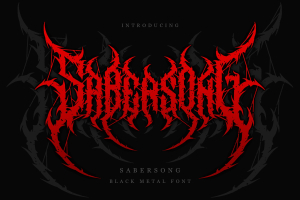
Bold and Aggressive The Impact of Gothic Fonts
Bold and Aggressive The Impact of Gothic Fonts

Gothic fonts, also known as blackletter or medieval fonts, have been around for centuries and continue to make an impact in modern times. Their bold and aggressive appearance can convey a wide range of emotions and messages, from elegance and sophistication to rebellion and subversion. Let’s explore the impact of gothic fonts and why they remain a popular choice for designers and artists.
-
Historical Significance
Gothic fonts have a rich history that dates back to the Middle Ages. They were commonly used in Europe for religious texts, manuscripts, and other important documents. The ornate and intricate letterforms were seen as a sign of prestige and sophistication, and were reserved for the upper class and educated individuals. Over time, gothic fonts evolved to include variations such as Fraktur and Blackletter, which became popular in Germany and other parts of Europe.
-
Visual Appeal
One of the main reasons why gothic fonts remain popular today is their unique and striking visual appeal. The sharp and angular letterforms, combined with the use of thick strokes and negative space, create a bold and aggressive appearance that immediately draws the eye. This makes gothic fonts an ideal choice for headlines, titles, and other design elements that need to stand out and make a statement.
-
Association with Gothic Culture
Gothic fonts are also closely associated with gothic culture, which has been popular since the 1980s. Gothic culture is often characterized by its dark and mysterious aesthetic, which includes elements such as black clothing, dramatic makeup, and gothic literature. The use of gothic fonts in design and art can evoke a sense of rebellion and nonconformity, making them a popular choice for those who want to express their individuality and uniqueness.
-
Versatility
Despite their bold and aggressive appearance, gothic fonts are also versatile and can be used in a wide range of contexts. They can convey elegance and sophistication when used in the right way, and are often used for wedding invitations, restaurant menus, and other high-end design projects. Additionally, gothic fonts can also be paired with other typefaces and design elements to create a more complex and layered visual effect.
-
Challenges and Considerations
Despite their popularity, gothic fonts also come with certain challenges and considerations. For one, they can be difficult to read, especially in smaller sizes or when used for body text. Additionally, their bold and aggressive appearance may not be suitable for all design contexts, and may even be seen as inappropriate or offensive in certain situations.
Another consideration is the potential for cultural appropriation. Gothic fonts have a long history and are closely tied to European culture, which may not be appropriate for use in designs that have no connection to that culture. As with any design element, it’s important to be mindful of the cultural context and significance of the fonts you choose to use.
-
Future of Gothic Fonts
As with any design trend, it’s hard to predict the future of gothic fonts. However, it’s clear that they will continue to be a popular choice for designers and artists who want to create bold and unique designs. With the rise of gothic culture and subcultures, it’s likely that gothic fonts will continue to be associated with rebellion and nonconformity, making them a powerful tool for self-expression.
In conclusion, gothic fonts have a long and rich history, and continue to be a popular choice for designers and artists today. Their bold and aggressive appearance can convey a wide range of emotions and messages, making them a versatile and powerful design element. However, it’s important to be mindful of their potential challenges and considerations, and to use them in appropriate contexts. Whether you love them or hate them, gothic fonts are here to stay.


Leave a Reply
Want to join the discussion?Feel free to contribute!